
Methods
Experts
The Report Card was coordinated through the Aquarium of the Pacific but was powered by the volunteer contributions of over two dozen experts across California as well as Aquarium staff. These experts helped source data, contributed to the development of the evaluation methodology, provided interpretation of the data, and wrote sections of the Species Accounts or other parts of the Report Card. We are grateful to each of them. You can read more about them on the Contributors page.
Data Sources
The data used in the Report Card are from a variety of sources, representing field work or remote sensing performed by hundreds of scientists and students. Long-term studies and monitoring programs conducted by government agencies or academic researchers also contributed data. Finally, citizen scientists have contributed to several of these monitoring programs. All data are public. The data provider(s) for any given species are documented on the Species Account.
Two California initiatives were especially crucial to this effort: MARINe Network (Multi-Agency Rocky Intertidal Network) and California’s Marine Protected Area (MPA) long-term monitoring program. These programs represent the commitment of a community of scientists and organizations, collaborating to collect data that will help us better understand and manage our marine life. Our hope is that this report card and our commitment to institutionalizing the report will help grow species monitoring programs throughout the state.
Minimum Data Requirements
The long-term data were screened to ensure they met two criteria: 1) population estimates were obtained for ten or more years, 2) population estimates were available from at least as recently as 2019. Given that a species met these criteria, we restricted our analyses of trends to data from 1999 onwards, even if there were data available from earlier years. In many cases significant population declines had occurred before our 1999 “start date”. In such situations, our species narrative refers to major historical events prior to 1999, but we do not formally analyze trends using those earlier data. Going forward for future Marine Species Reports, by adding on to these time series beginning in 1999, scientists may be able to detect changes in population trends before it is too late to respond.
A Wide Variety of Methods for Estimating Abundance for Trend Analyses
Counting plants and animals is not as straightforward as it sounds. One might use drones or aerial surveys to estimate hectares (or acres) covered by kelp. Citizen volunteers standing with binoculars on the shore may tally up the number of migrating gray whales passing by. Individual giant sea bass have distinctive markings that allow divers to spot a fish as a “recapture” if it is a second sighting of the fish. This allows one to estimate population size using what are called mark-recapture methods. In the intertidal zone density can be estimated by placing down a square meter quadrat and counting all the mussels for example in that quadrat. Along the San Gabriel River, volunteers stand at regular sampling stations with clipboards – tallying up all the green sea turtles they see. Alternatively, one can swim or walk line transects and count individuals seen while scanning along a transect of known length. Underwater remotely operated vehicles (ROV’s) might be used to search for exceedingly rare white abalone, and the number of abalone noted per unit of time searching along the ocean floor provides an abundance indicator.
The key idea is that for trend analyses one need not count every animal year after year. Instead, we can sample, and as long as we are consistent and can adjust according to search effort, we can find out whether populations are increasing or decreasing, and at what rate.
Evaluating Trends using Time Series of Data
In all the graphs of data that we show, the year (between 1999 and 2024) is shown on the horizontal axis, and the vertical axis represents some index of abundance (count, density, area, nesting sites, etc). We consistently display the data in two ways:
- a bar graph of abundance versus year
- a trend line fitted to abundance data which has been log transformed.
As an example, below is an abundance graph from our Pacific sardine species account.
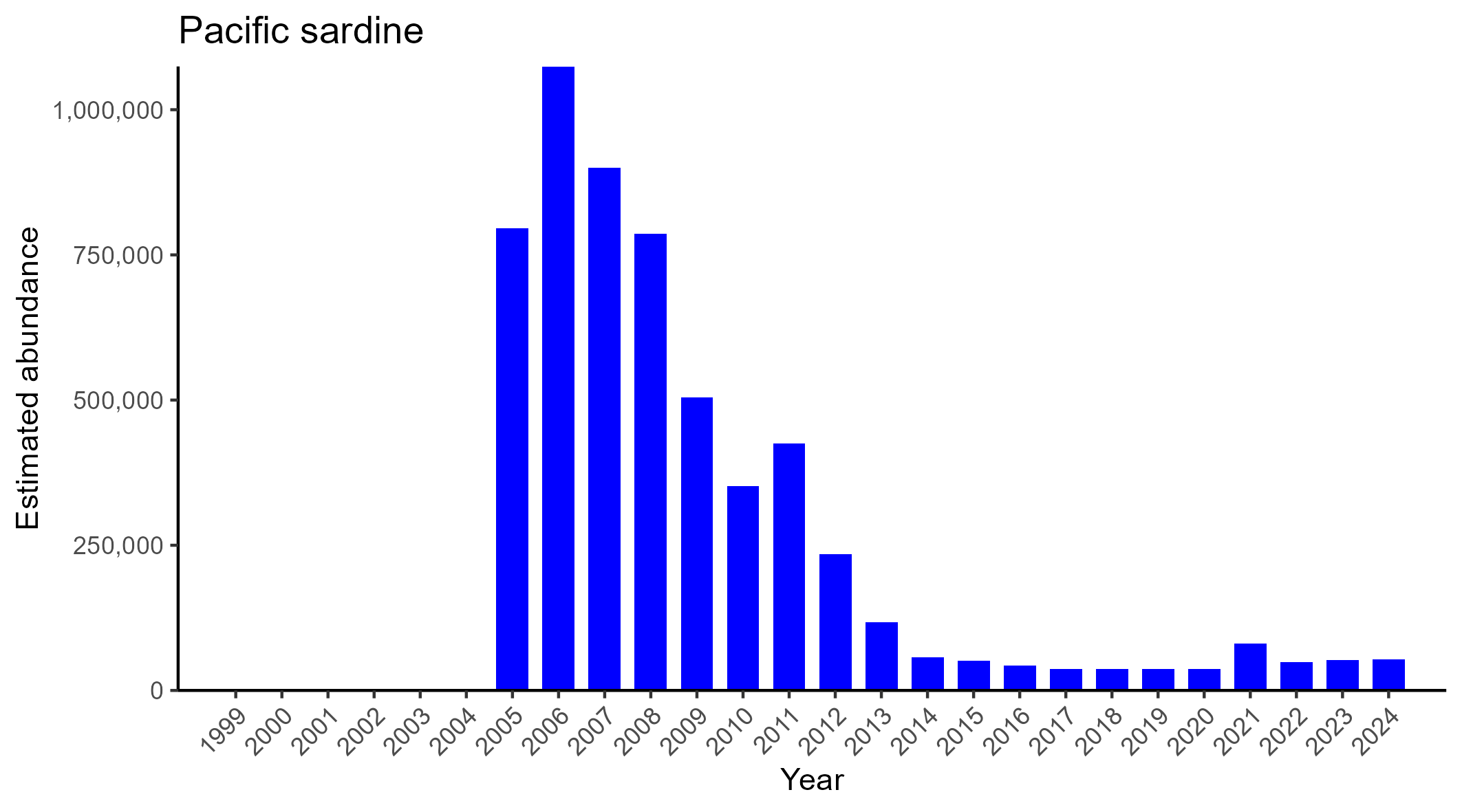
Simply by inspecting the bar graph, it is obvious the population has been declining. In all of our bar graphs, if a zero was recorded (meaning the survey was conducted but none were seen), we place an asterisk. There are no zeroes for sardines. The absence of a bar does not indicate zero, rather it indicates data were not available for that year. The next question is what is the rate of the decline? Answering that requires a formal trend analysis. Before calculating our trend line, we take the log of whatever abundance indicator is being used. We do this because populations grow by multiplication and the rate of that population growth (or shrinkage) can be estimated from a line fit to log transformed data. When we do this for the sardine abundance data shown above, we obtain:
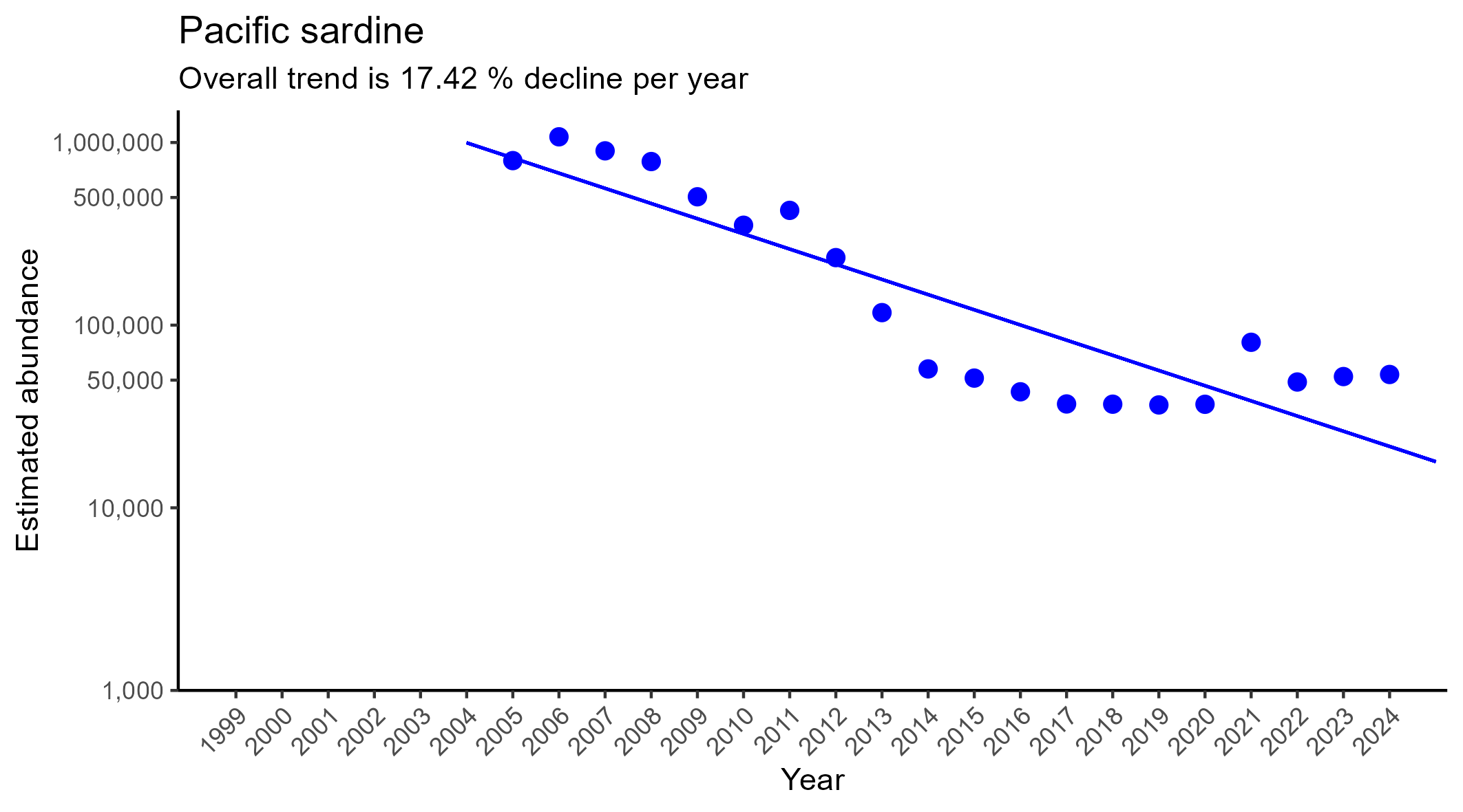
It is important to note that while a trend line can be fit to any time series of data, that line may not do a very good job describing the data. To quantify the extent to which a simple trend line captures how a population varies between 1999 and 2024 we used the percent of year-to-year variation that this trend line explains. If the percentage is high as it is in the graph above, we can conclude the simple model of a constant rate of decline describes moderately well the sardine data from 2005 to 2020
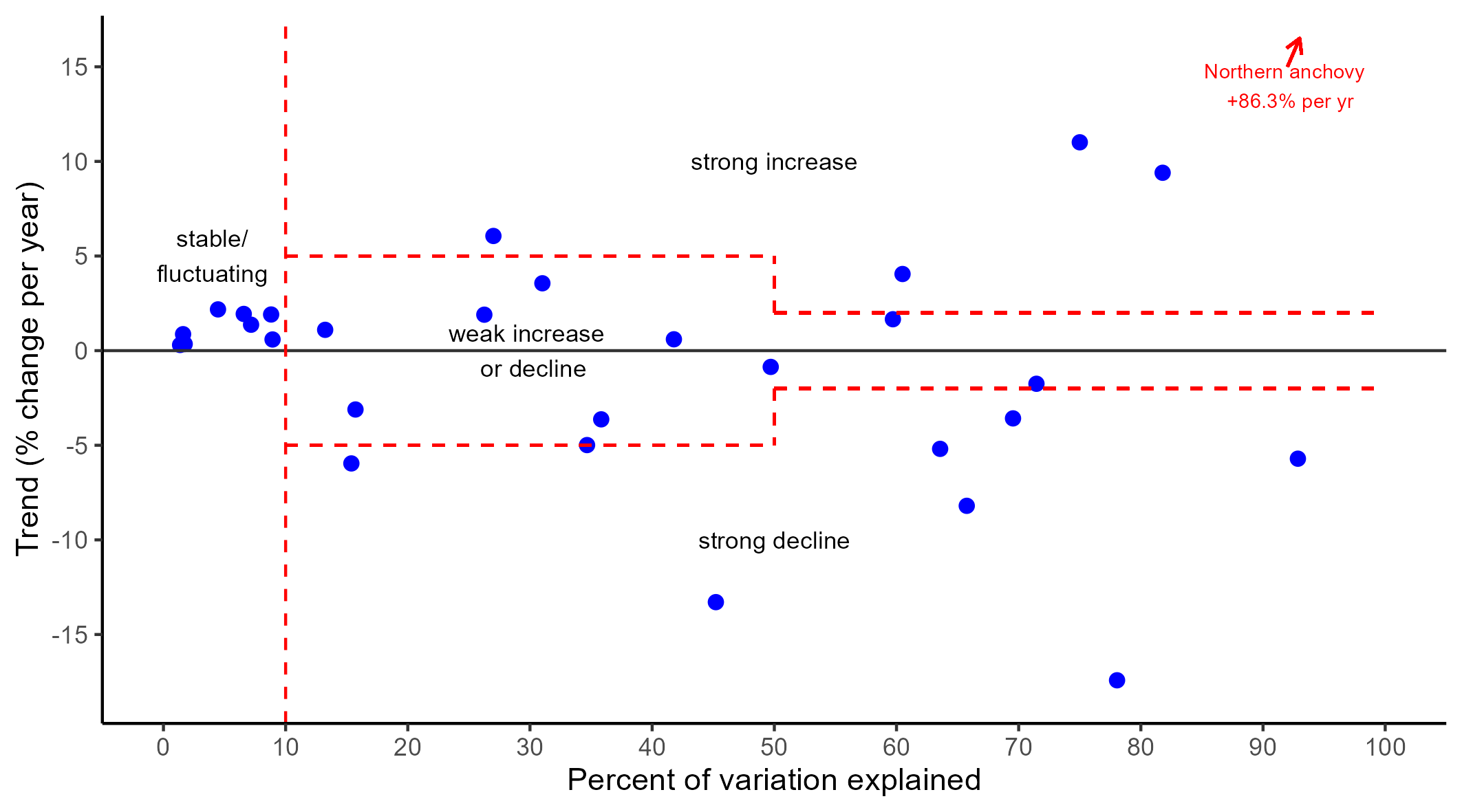
Specifically, the above trend line explains 78% of the year-to-year variation in sardine abundance. The rate of this decline is over 17% per year. In other examples the trends are not so clear, which led us to devise a framework for classifying time series of population data into categories of increase, decrease, or no consistent trend (stable with variation). To do this we used a combination of the magnitude of the estimated annual decline and the “% variation explained” by that annual decline as follows:
If a trend line cannot describe the variation in abundance from year to year (either there is no change or the change entails fluctuations but no consistent trend) then we label it stable with fluctuations or just “stable”. The cutoff for this category was 9% of the variation explained. Less than 9% variation explained means no trend for our purposes.
The next categories were weak increase or weak decline. “Weak trend” is the category to which a species was assigned if:
- the trend line did not explain much of the variation (between 9% and 49%) but the estimated rate of change was high (greater than 5% annual change), or if
- the trend line described more that 49% of the variation, but the magnitude of the annual rate of change is less than 2%
Strong increase or decline corresponds to a mix of high estimated rates of change and significant portions of the inter-annual variation explained. All of this is best seen in the graph below which places each species in a plot of trend (% change per year) versus percent variation explained by simple trend line:
Analyses by Location
For all species we provide an overall trend in which we aggregate data from multiple sample locations. However, there may be striking regional differences that are overlooked by aggregating over the entire coast. For this reason, whenever ample data were available, trends were also examined by the same four regions specified in the monitoring programs: North Coast, North Central Coast, Central Coast, South Coast. However, we discuss and display regional data only if there seem to be important differences. Also, some species may not occur in all regions.
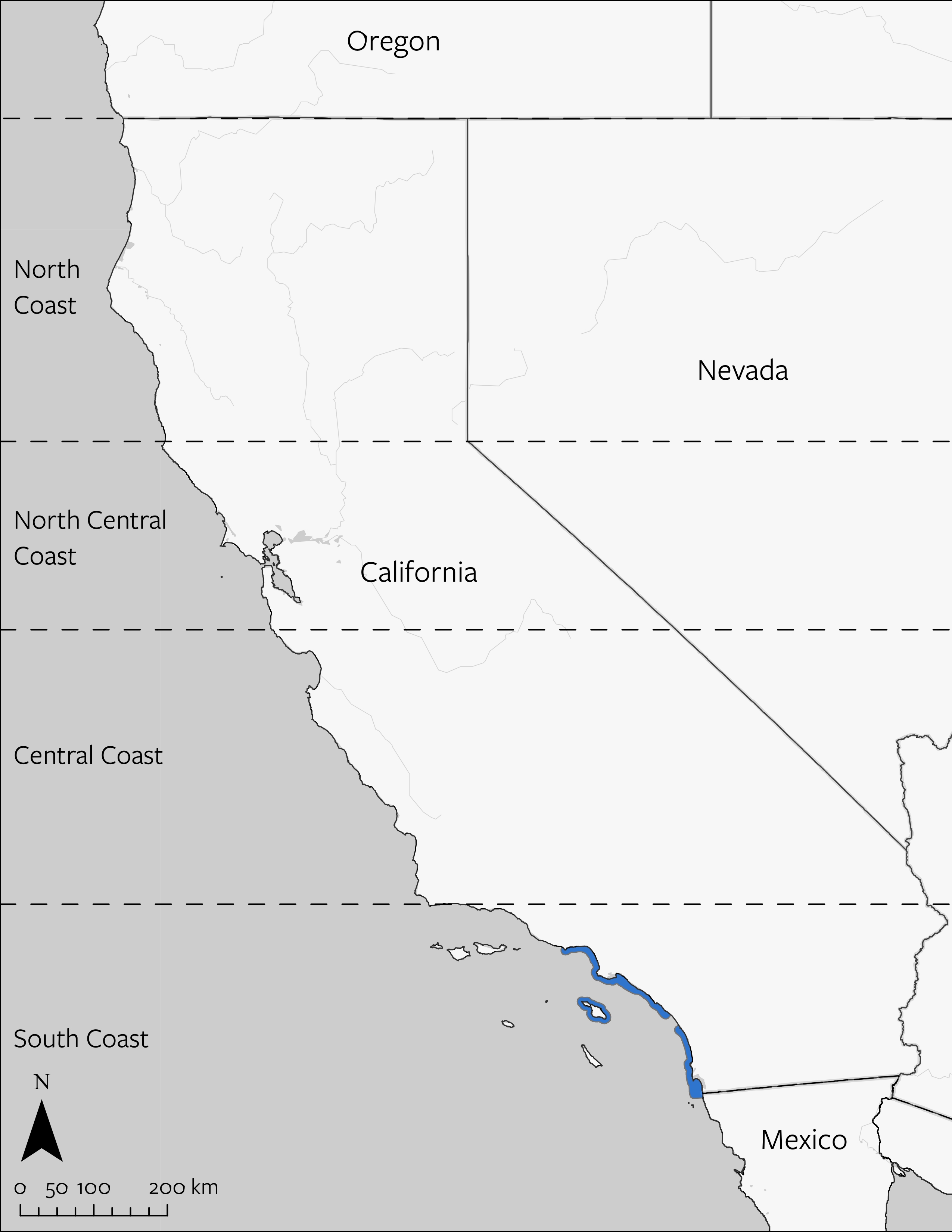
- North: California/Oregon border to Alder Creek near Point Arena
- North Central: Alder Creek near Point Arena to Pigeon Point, including the Farallon Islands
- Central: (Pigeon Point to Point Conception)
- South: Point Conception to the California/Mexico border
When the data or ecological context was better suited to different segmentation, we tailored analysis to that segmentation – such as within a Marine Protected Area versus reference sites that lie outside any protected area.
Threats
Using a literature review, our team identified the primary threats affecting each species at present. For a species to be assigned a threat, there needed to be a peer reviewed or official government report that documented the threat – anecdotally discussed, or a predicted possible future threat that had not yet had a negative impact were not recorded as current threats.

Climate Impact
The changing climate resulted in system-wide changes to the seawater or coastal air which impact the species of interest. These changes may be permanent or intermittent. This includes phenomena such as warmer sea surface temperatures, warmer air temperatures, sea level rise, changes in ocean currents or upwelling, ocean acidification, and more frequent severe weather.

Food Web Imbalance
The natural balance between predators and prey is disrupted, and in turn is impacting the species of interest. The root cause of the imbalance could be driven by introduction of an invasive species whose population grows without bounds, climate change, such as when coastal upwelling stops the flow of nutrient-rich deep water to the surface, or overharvest of one species that may be the prey (or predator) of the species of interest.

Habitat Loss and Degradation
The loss of habitat or quality of habitat from persistent change, typically the result of human activity. This includes loss of substrate (e.g., shoreline is developed), water quality impairment (sedimentation/turbidity), and erosion.

Human Disturbance and Harassment
Direct harassment by humans or acute, non-consumptive disturbance from human activity which negatively impacts the species of interest. This includes shoreline use, trampling, beach grooming, excludes fishing, harvest, and poaching (which are in the threat titled “extraction”).

Extraction
Direct consumptive use of the species of interest such as through fishing and collection.

Pollution and Disease
Human-generated fouling of the natural environment and disease (which may not be connected to the pollution). Sources of pollution could be activities such as oil spill, nutrient run off (eutrophication), sewage outfall, and trash including plastics.
Protected Status
Protected Status
Protected status is used to designate if a species is protected under U.S. federal law such as listed under the Endangered Species Act as endangered or threatened. It is shown in the Report Card as white fish on a red background in the corner of a species image.
Narratives
The population trend information and threats are written about in the ‘threats and conservation status’ section of the species account. This is supported by five additional natural history sections (morphology, habitat and range, reproductive biology and life history, ecology, culture and historical context) to add brief context on the species. Information is divided into sections so the reader can focus their attention on content that is of greatest interest to them. References for this information are provided. An effort has been made to identify “open access” publications – which are scientific articles one can find via various search engines and download for reading (as opposed to requiring access to a university library).
Peer Review
Each species account was sent to at least 2 peer reviewers outside of the core contributor group. These peer reviewers were selected for their species expertise, and were asked only to review the species for which they had expertise. In total we benefited from 60 peer reviews.